SoftwareOne
New York
UX/UI
2023
SoftwareOne
Designing for a new brand with a global purpose- to provide software and cloud solutions to businesses worldwide.
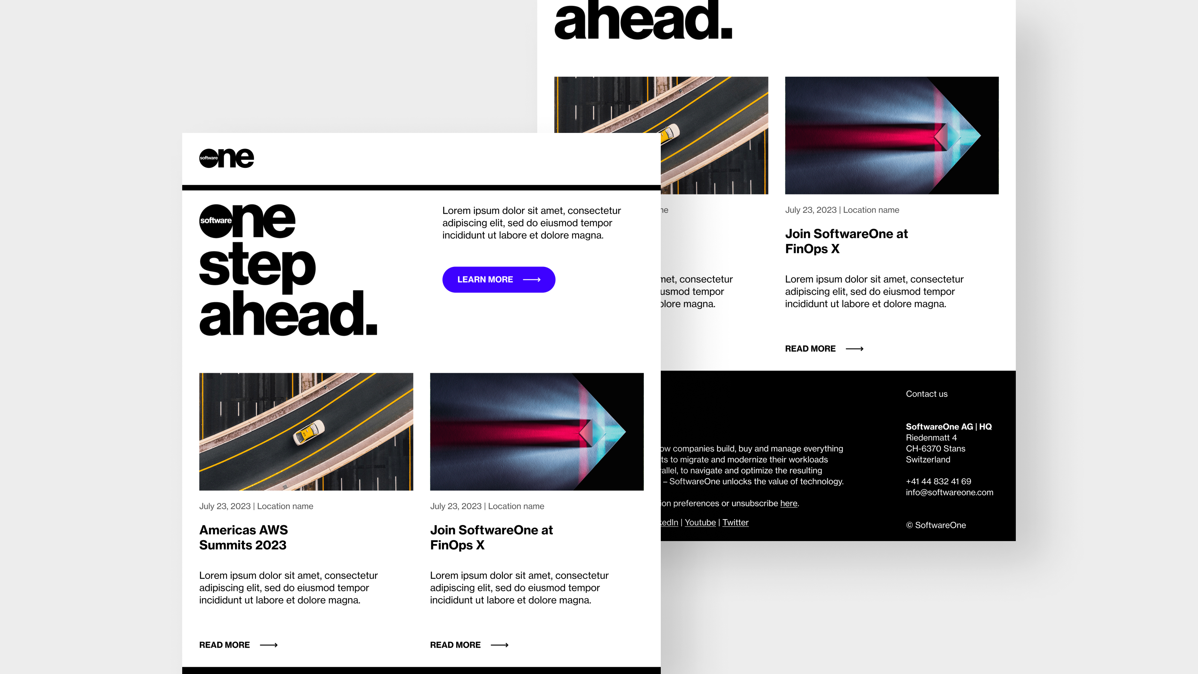
Designing for a new brand with a global purpose- to provide software and cloud solutions to businesses worldwide.
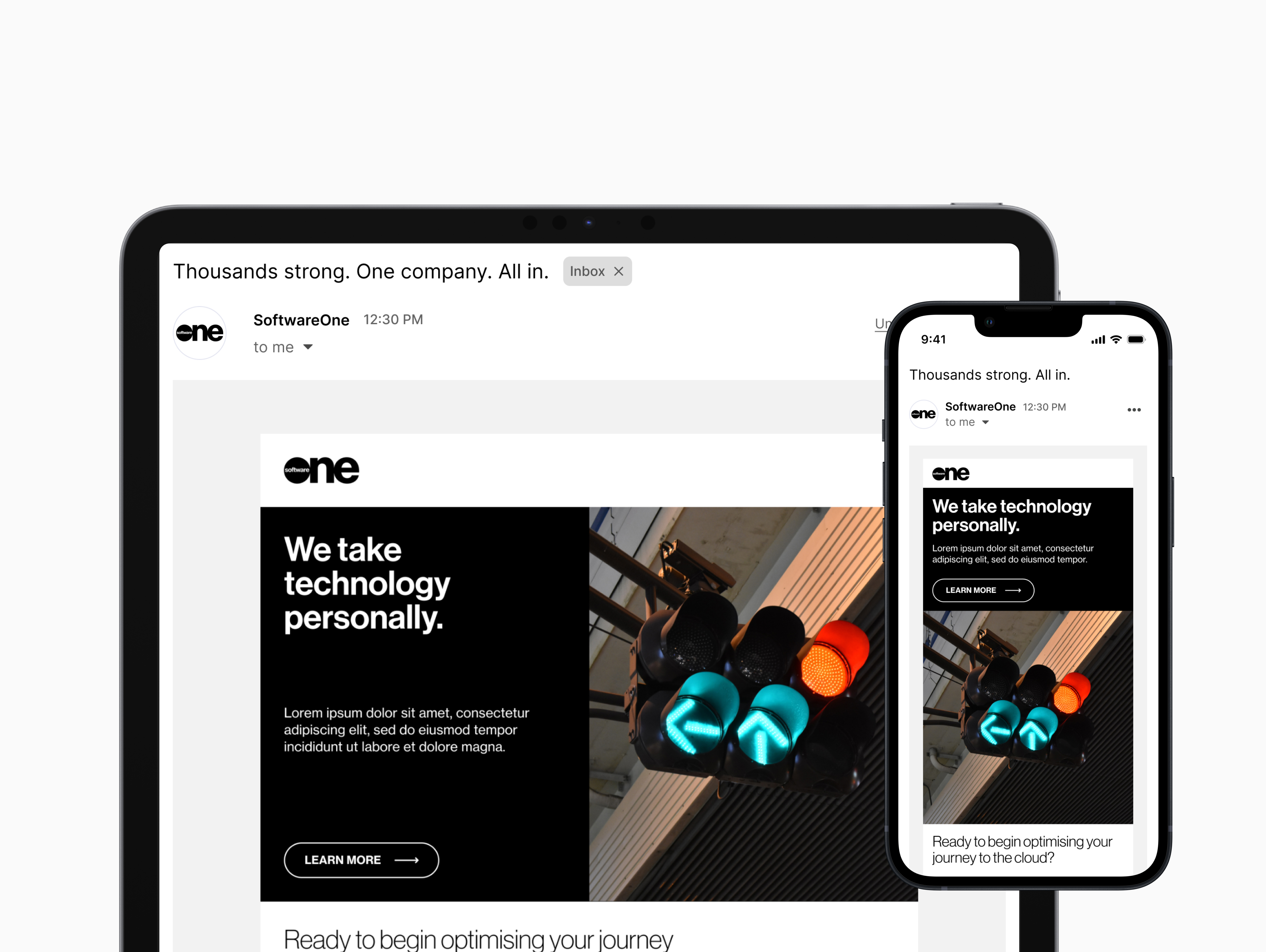
The leading global software and cloud solutions provider aimed to optimize their approach to email marketing to inform customers of new products and initiatives. While the platform allows users to mix and match modules to build a custom layout, the template presents several issues.
I was responsible for optimizing the modules in the SoftwareOne email marketing template. This involved auditing, wireframing, prototyping, and a full redesign.
To ensure a holistic approach, I empathized with users and analyzed the fundamental aspects of the email template. This involved a deep dive into the system and interaction design to identify any gaps in the user experience. Additionally, a comparative analysis of existing email newsletters was used to brainstorm new ideas. Building on user goals, I developed a modular set of branded components that allow for seamless integration into the platform and supported various types of emails.
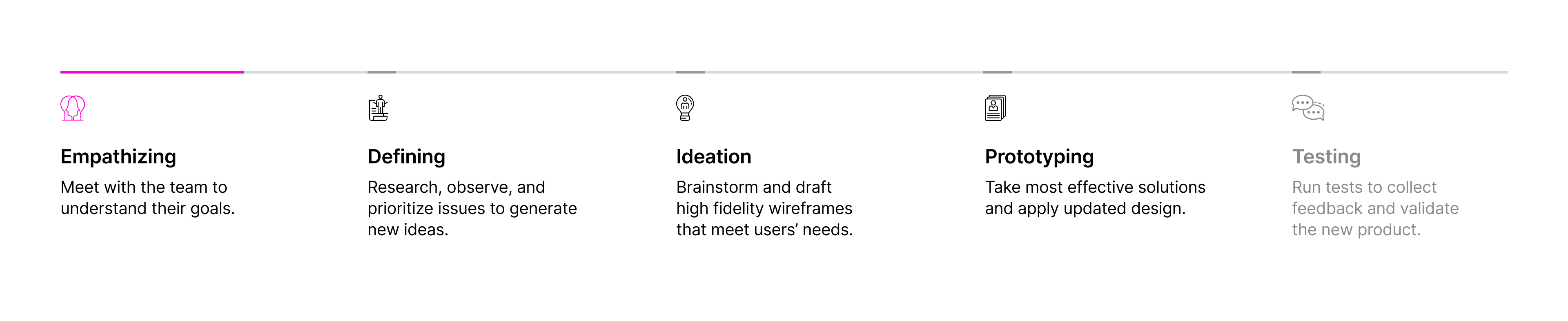
Design thinking played an integral part in shaping the user experience. I simplified my design process into five overarching phases, making it easier to understand the flow of this process.
The existing template presented several usability flaws for both internal and external users. The key objectives for this redesign included:
Defining a clear structure for Call-to-action and UI elements
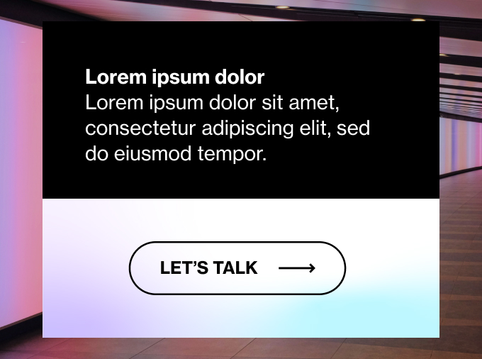
To ensure brand consistency across all communications, the team focused on establishing a clear structure for CTA buttons with primary, secondary, and tertiary attributes.
Providing greater flexibility and configurability
To allow internal users to create custom layouts without requiring any additional effort from the development team, they expressed a need for a more flexible layout with more modular blocks.
Expressing the vitality of the updated SoftwareOne brand
To better leverage all the SWO brand expression has to offer, there is a need to go beyond simply skinning the existing modules and incorporate more design elements that would capture the brand's refreshed look and feel.
Designing a responsive email template
We need to design a responsive template that would look great on all major email clients, ensuring a better user experience for both internal and external users.
After meeting with the team to understand their goals, I examined existing newsletters to grasp a better understanding of the information architecture. Additionally, I conducted a comprehensive review of specific pages and interface components to identify potential user pain points.
.jpg)
The platform has one template in the system, providing all the modules necessary for the creation of SWO emails. However, the lack of branding and customization negatively affects the user experience. Given that emails offer a more personal and direct form of communication, enhancing the user experience is critical for fostering customer relations.
.jpg)
.jpg)
After noting down the issues I came across during the audit, I decided categorize and prioritize these issues based on their impact for the design phase.
Email template design and experience is heavily outdated
Elements fail in inbox and do not degrade gracefully. This issue is significantly impacting the basic functionality of the design.
Non-interactive buttons
Preference for live content is absent. For instance, the design only has custom text embedded into graphics. This is not a critical issue but still impacts the overall effectiveness of design.
Unresponsive and ineffective data presentation
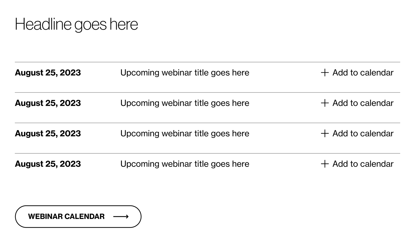
Does not accentuate data points such as KPIs or dates, making it difficult to organize lists of webinars and events.
Tables that do not easily translate for mobile. This can be seen as a critical issue in today's mobile-first world.
Inconsistent button labels
Button labels that do not match the rest can disrupt flow and confuse users. This is not an urgent issue but should still be addressed.
Nonequitable design
Translations result in varying content lengths, causing line breaks in CTA's, and affecting overall design.
Layout design lacks sufficient branding
The design lacks sufficient branding and color inclusion to focus content, making the template feel sterile. This could affect its visual appeal and impact on the audience.
The design includes too many call-to-action buttons without clear primary or secondary prioritization through color or other visual treatments.
Unoptimized layout structuring
Logo pairing in header against guidelines
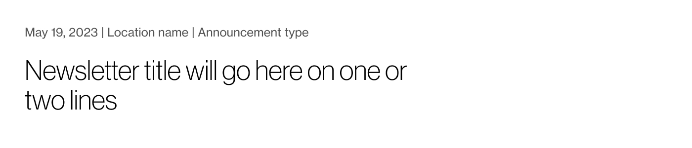
Newsletter date format not placed in a standard location
The design aligns components to the center, leaving both sides of the screen largely unused, which could lead to a less efficient and visually pleasing layout.

The design isn't mobile-friendly, lacking responsiveness and failing to highlight important data points. This can be confusing for readers and affect how we convey key information.

The preference for live content is not present. Buttons are custom text embedded into flat imagery. This affects the design's overall effectiveness, but it's not a major problem.

The design requires a consistent style and pronounced branding to emphasize key points. The current number of CTA buttons is excessive due to a lack of distinct primary and secondary CTAs.
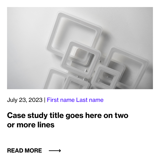
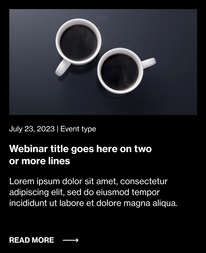
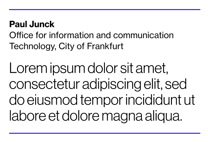
Initially, I categorized emails into transactional, promotional, or nurturing types, allowing me to identify common UI components frequently reused across campaigns. This analysis also helped me to pinpoint effective elements for maintaining brand consistency.
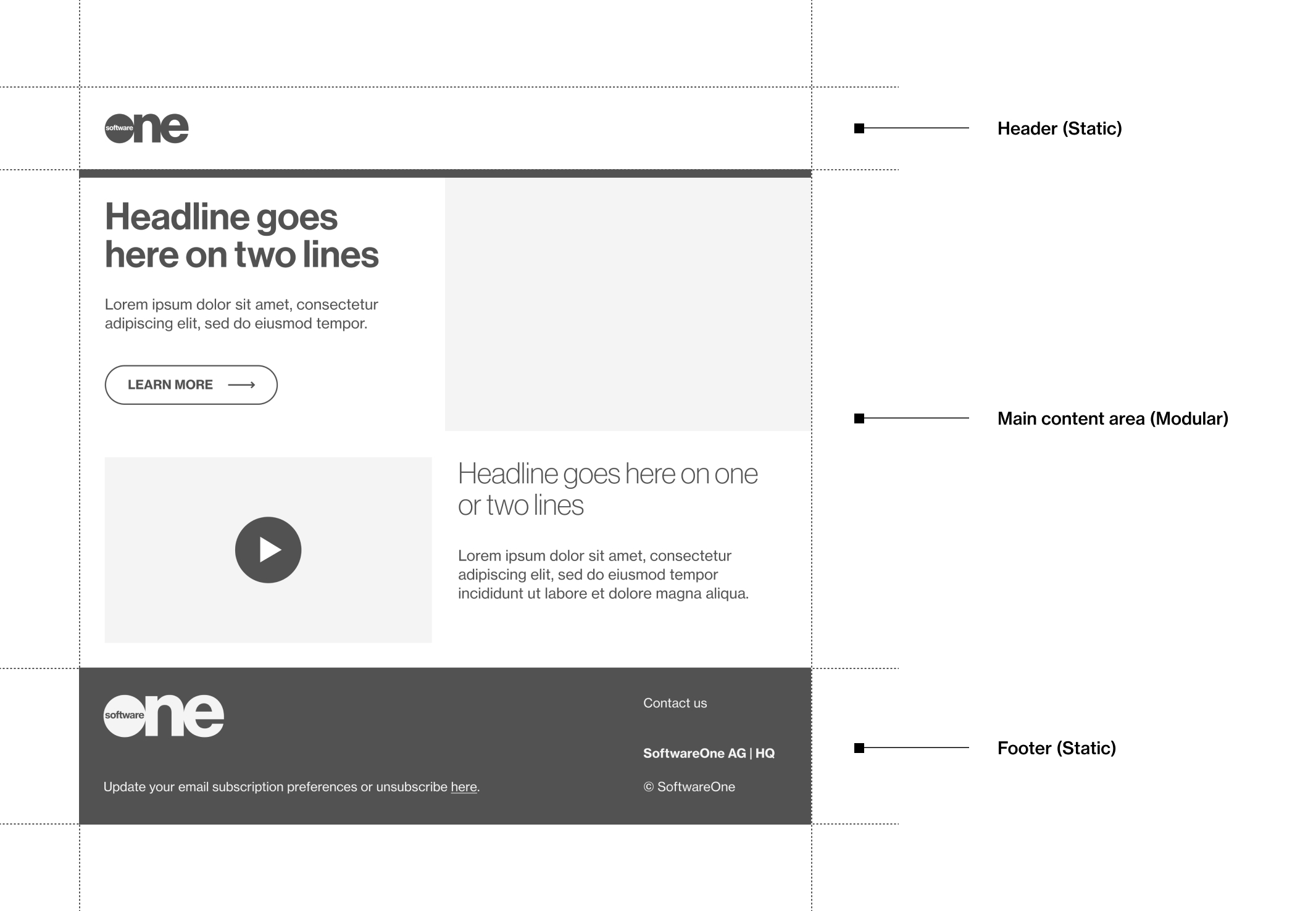
To ensure the design catered to a variety of user scenarios and variations in content, we designed a simple structure that consisted of a flexible main content area nestled between a fixed header and footer.
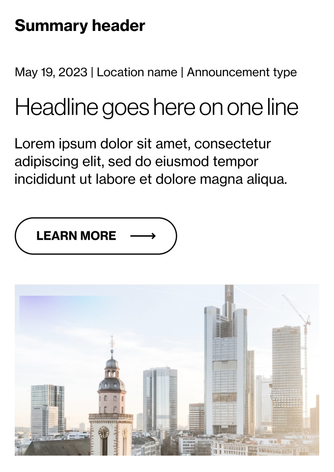
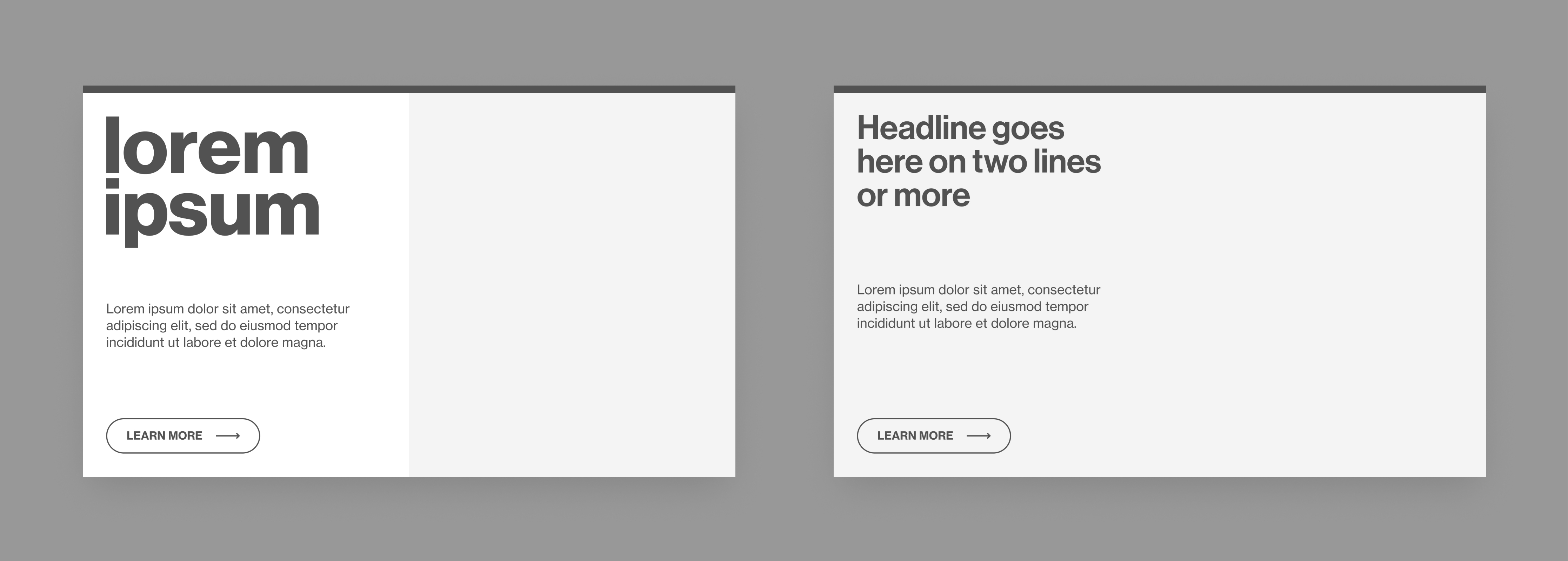
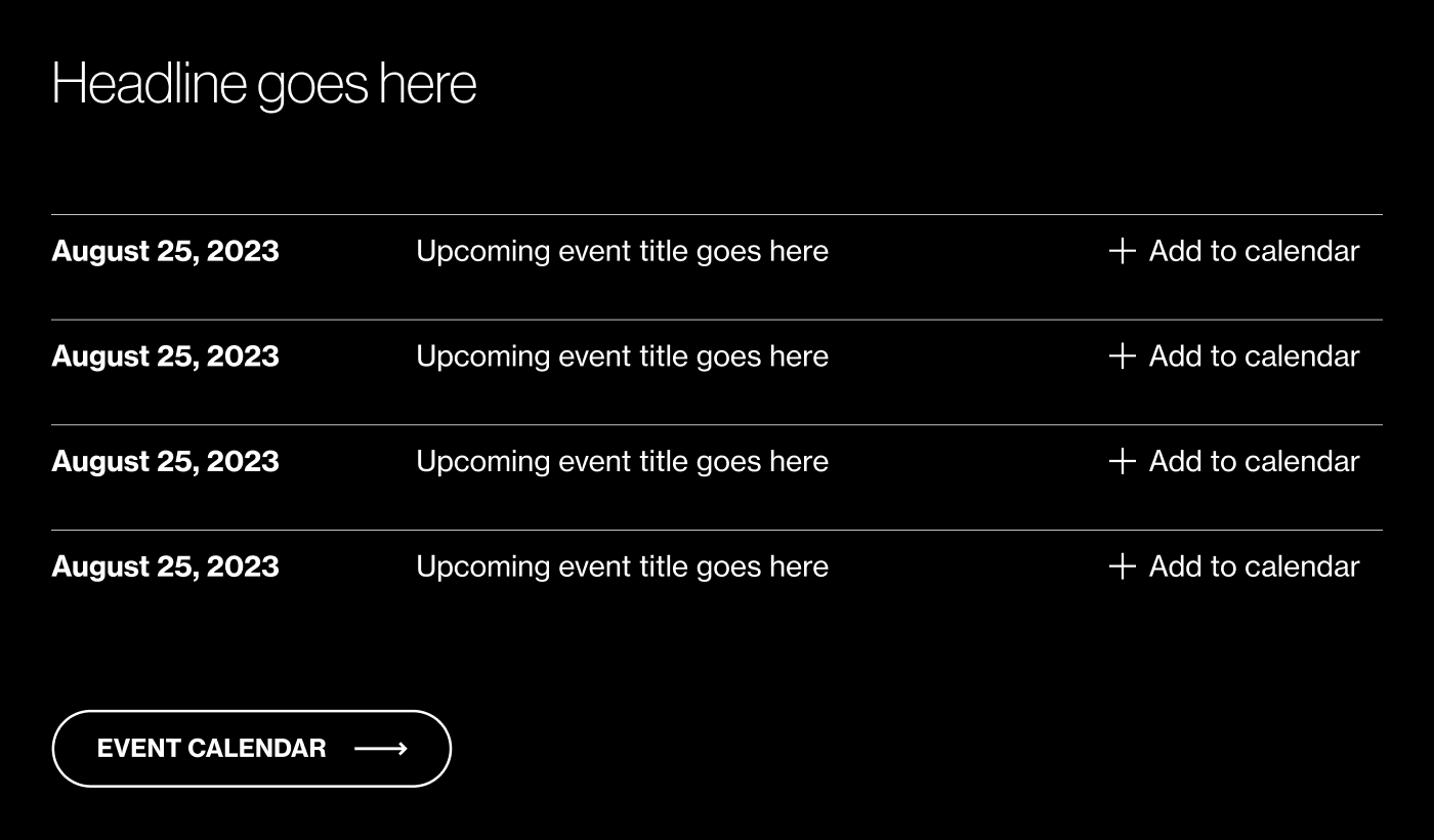
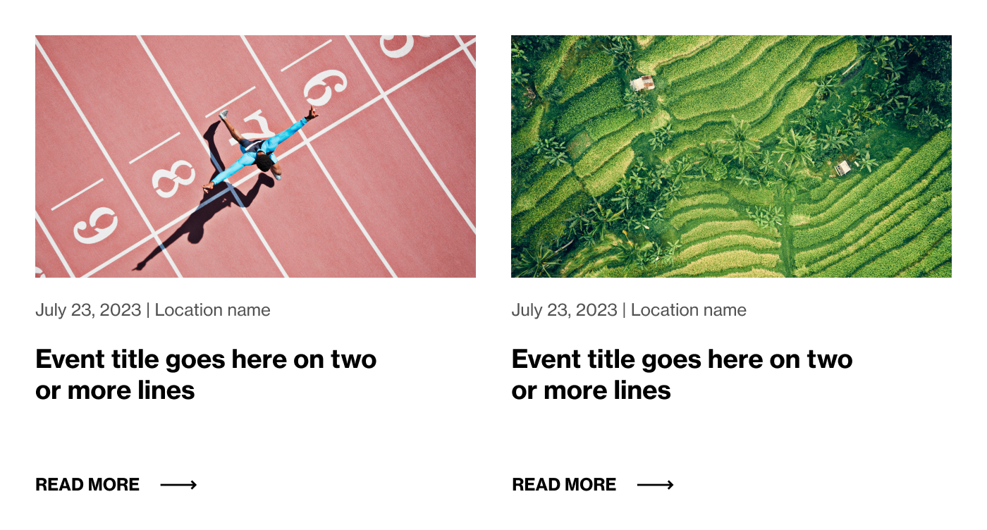
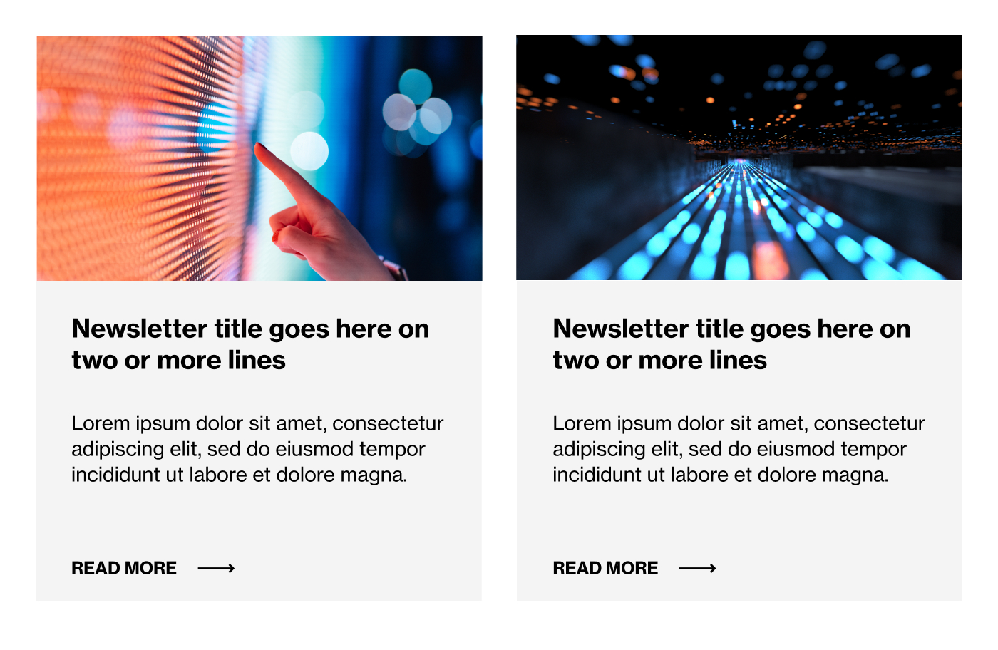
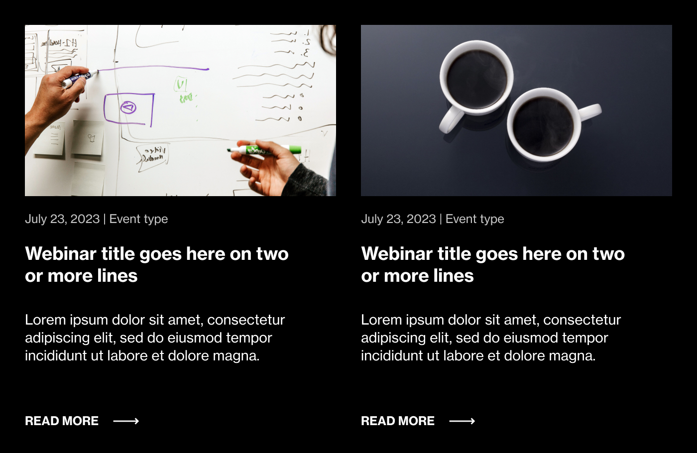
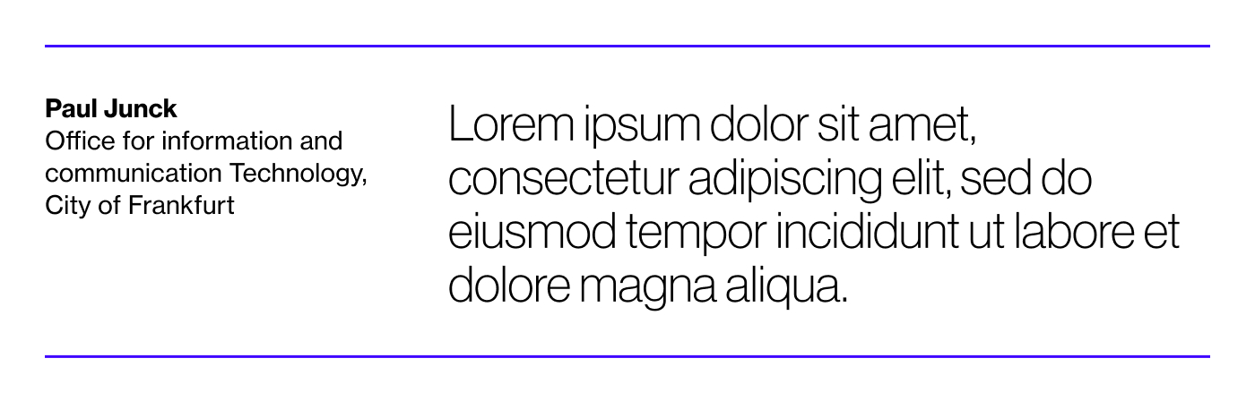
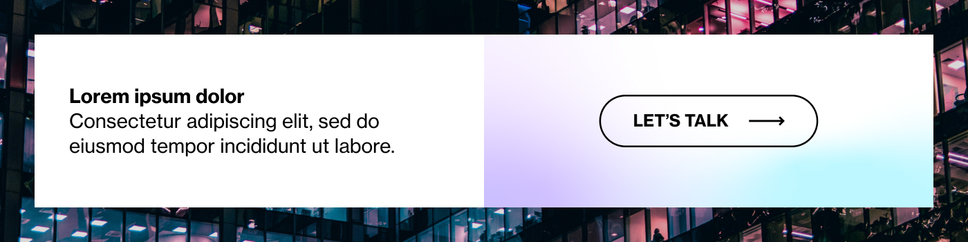
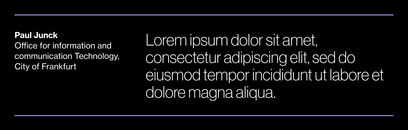
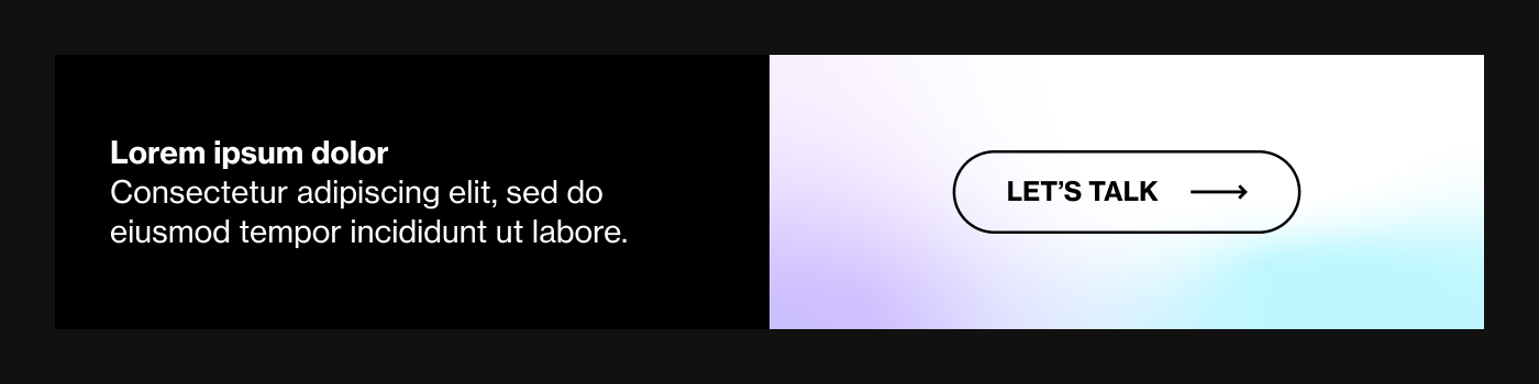
Component A: Hero Module
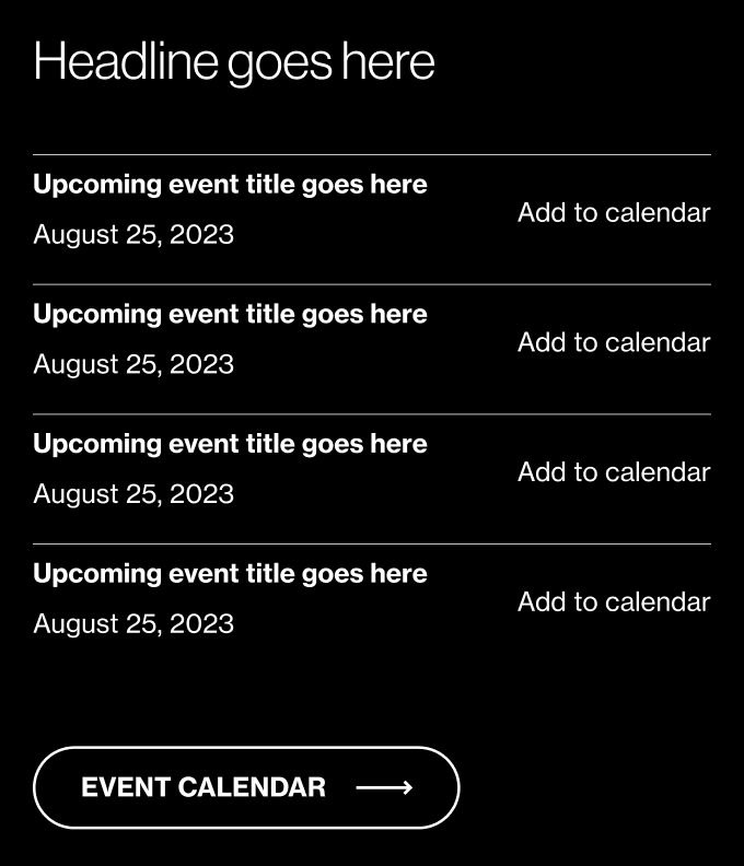
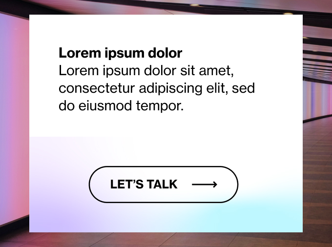
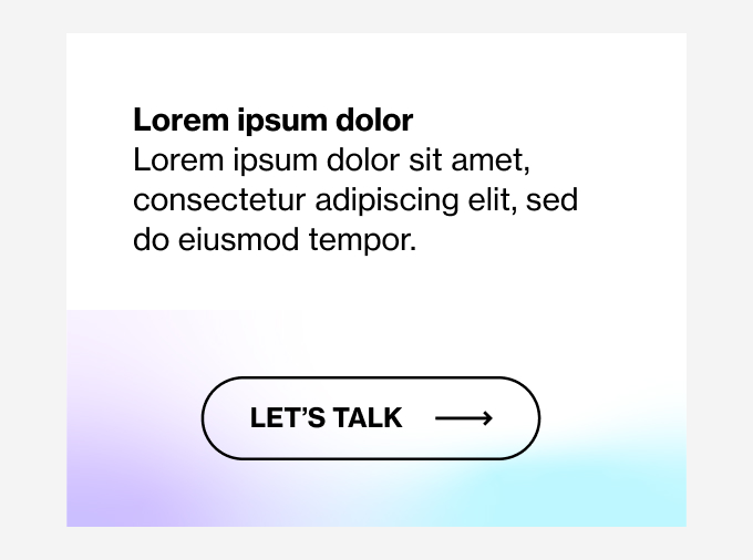
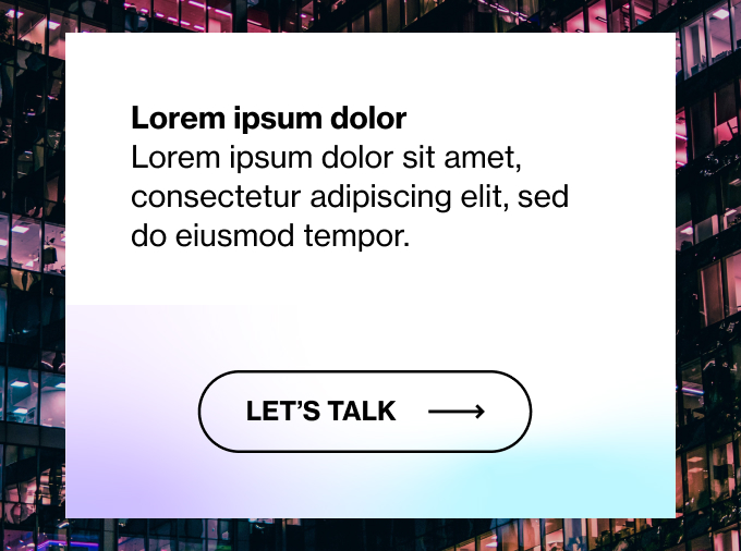
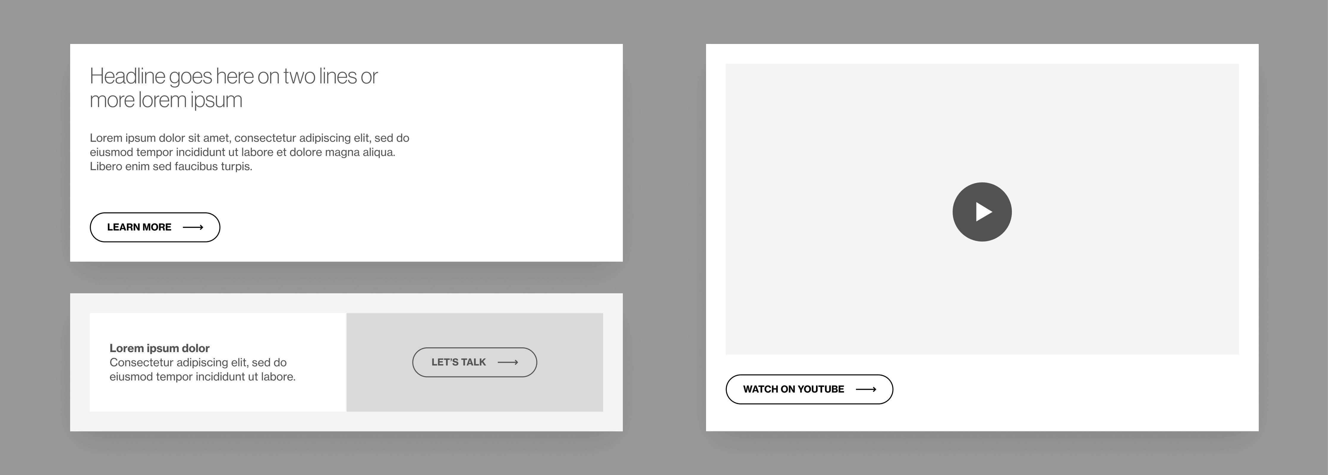
Component B: Action Module
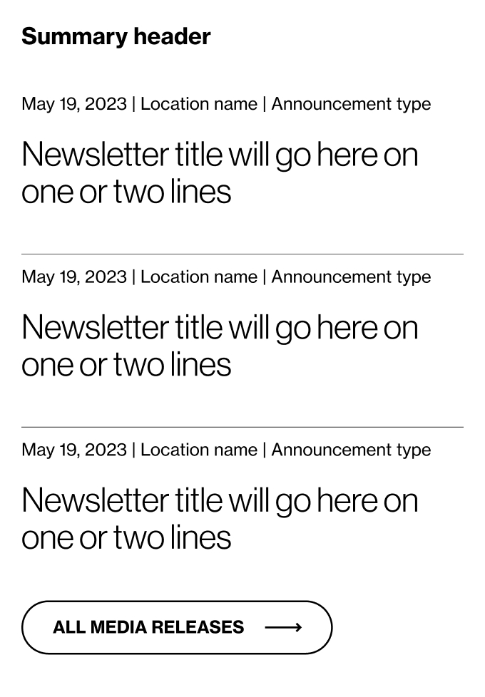
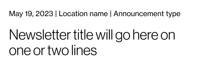
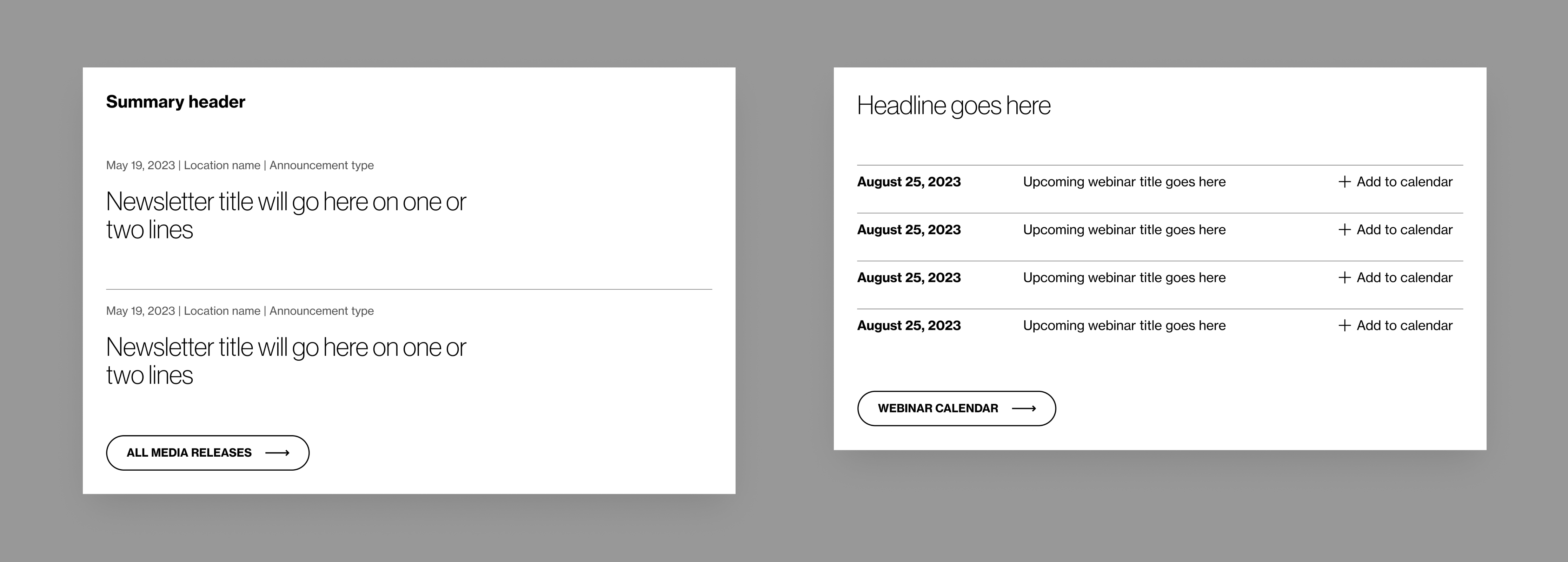
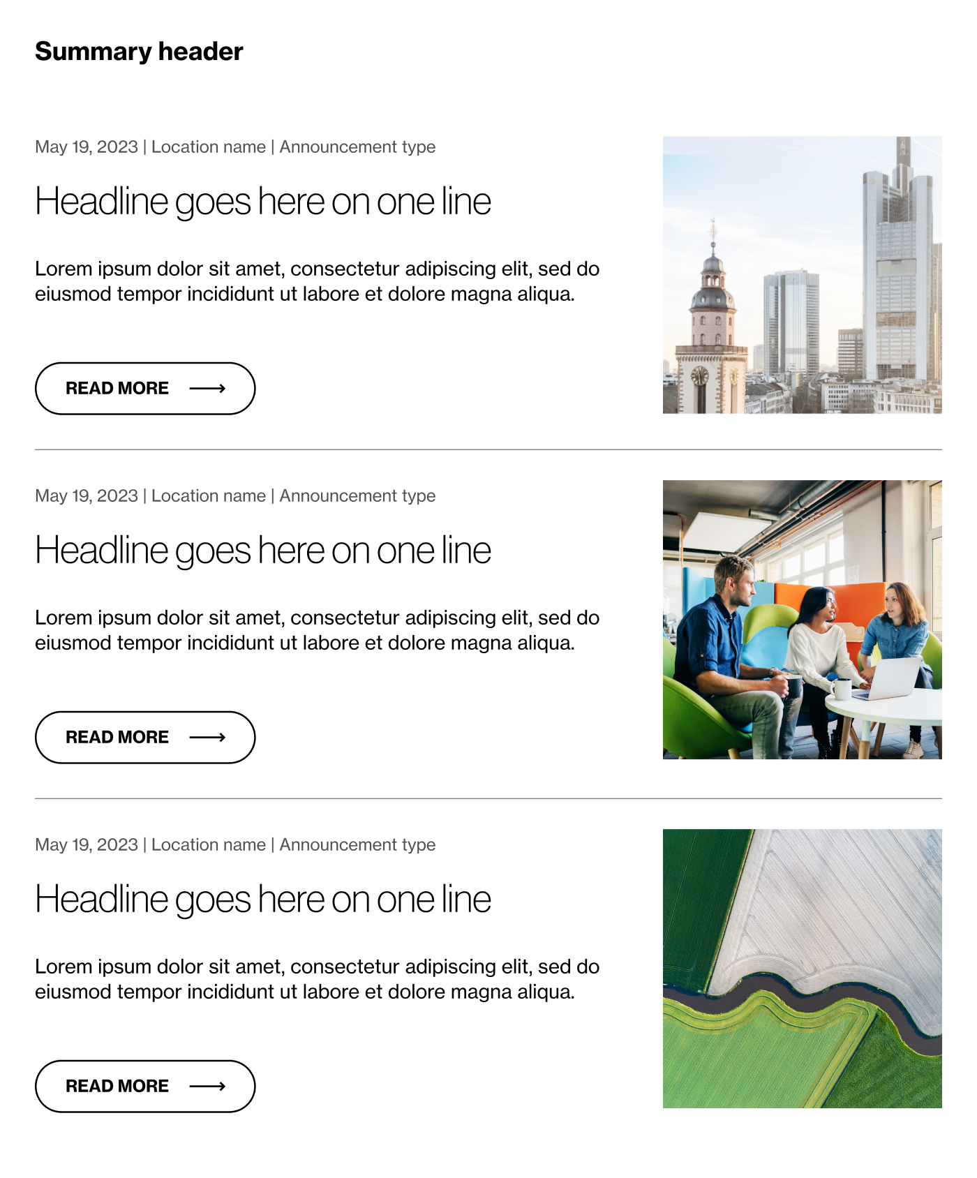
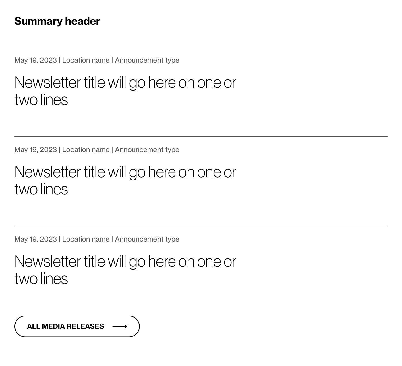
Component C: Informatioin Module
Based on the issues found in the audit, I drafted wireframes in Figma. Once the basic structure was set, I focused on elevating the visual look and content strategy.
SoftwareOne's brand guidelines served as the backbone for consistent branding when designing the pre-built standalone components. Using the core visual styles, I also defined a library of ways to treat the CTAs and links, trying to pull in some of those subtle differences established on the platform. The result was a set of engaging templates ready to share SWO's initiatives.

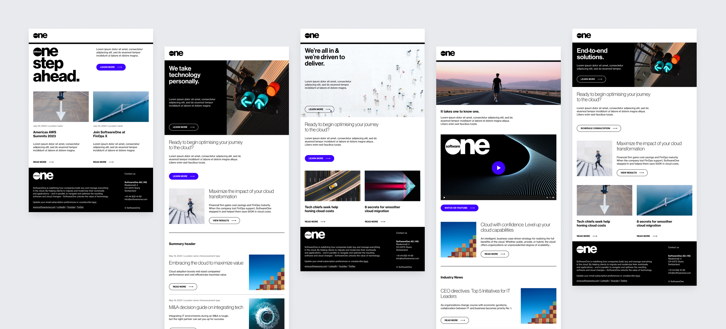
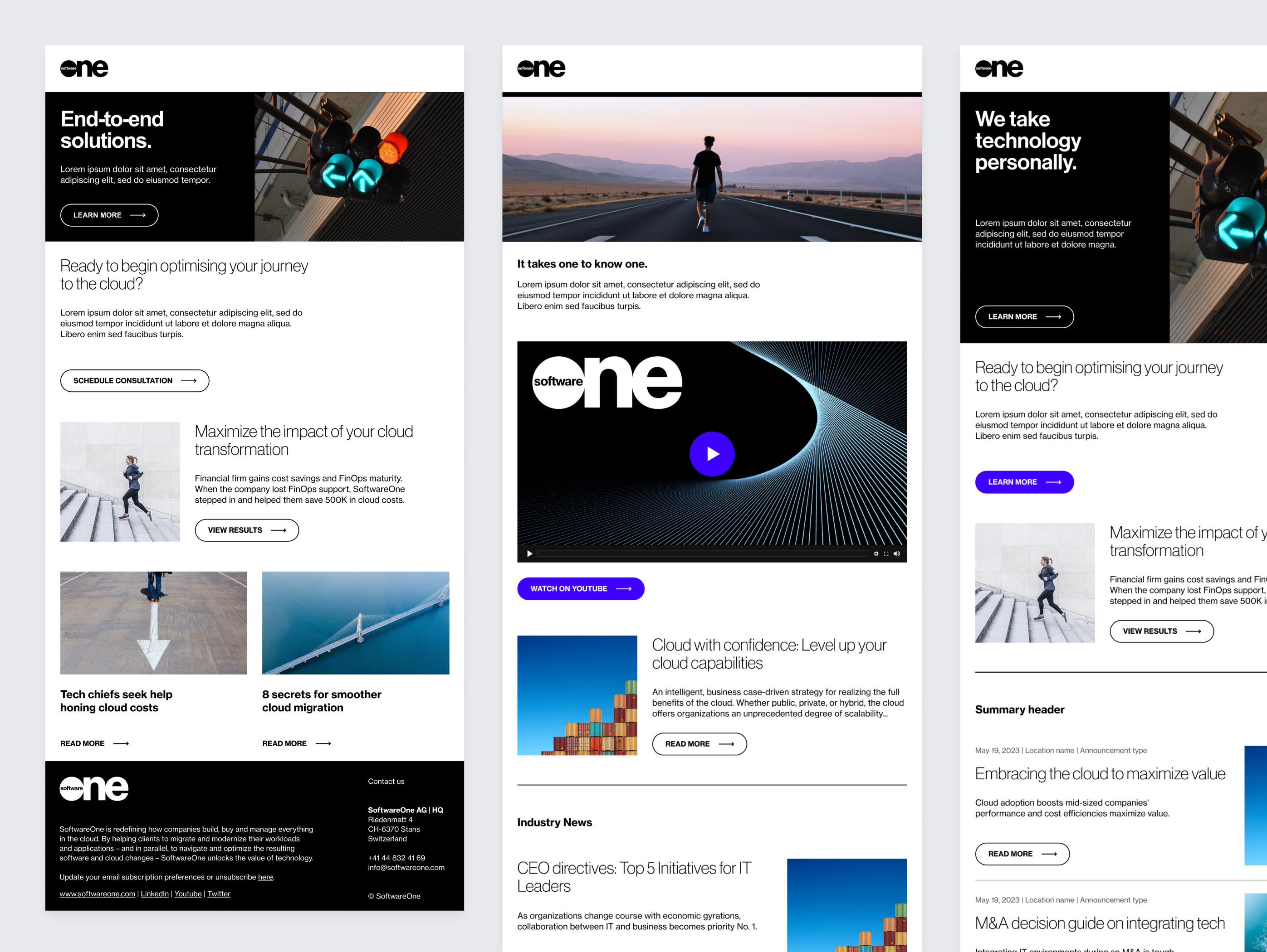
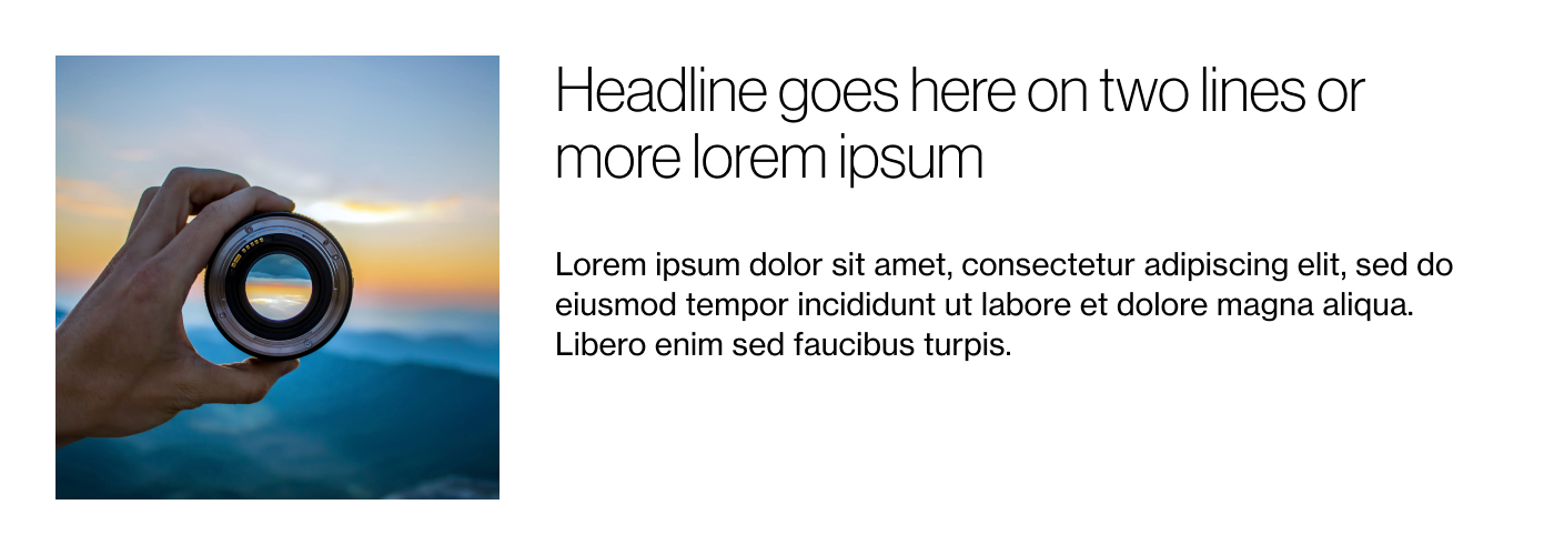
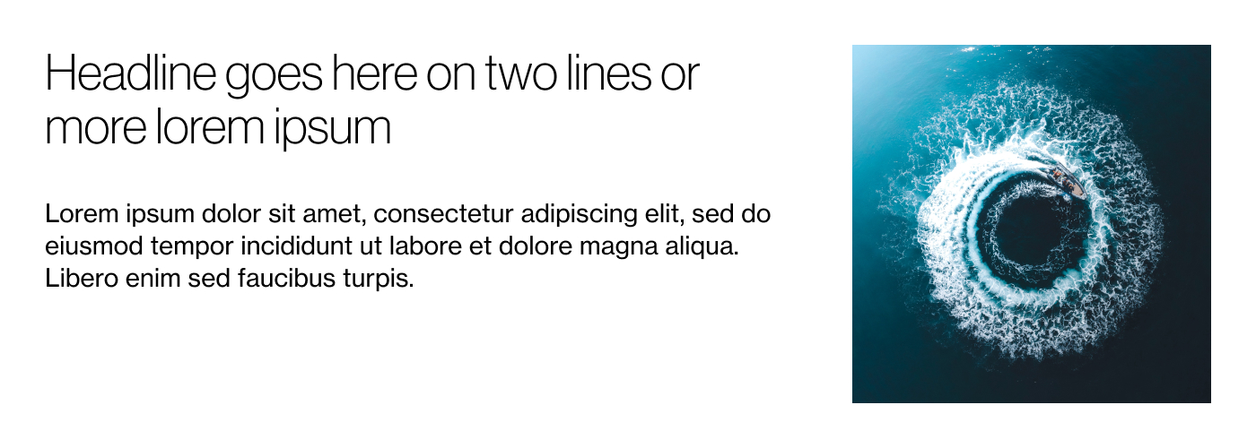
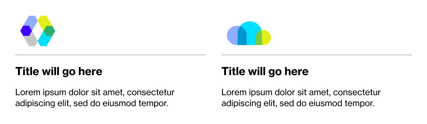
In the delivery of our flexible template, we ensured responsive behavior by implementing two breakpoint classes within the framework of our design. This allowed us to define specific attributes for optimal viewing on both desktop and mobile platforms. The lightweight and simple structure of our emails was purposefully maintained to allow for easy integration into the Marketo platform.
%20-%20Text%20and%20CTA%20with%20Branded%20Phrase.jpg)
%20-%20Text%20and%20CTA%20on%20Image.jpg)
%20-%20Text%20and%20CTA%20on%20Image.png)
.jpg)
%20-%20Text%20and%20CTA%20with%20Image.jpg)
.jpg)

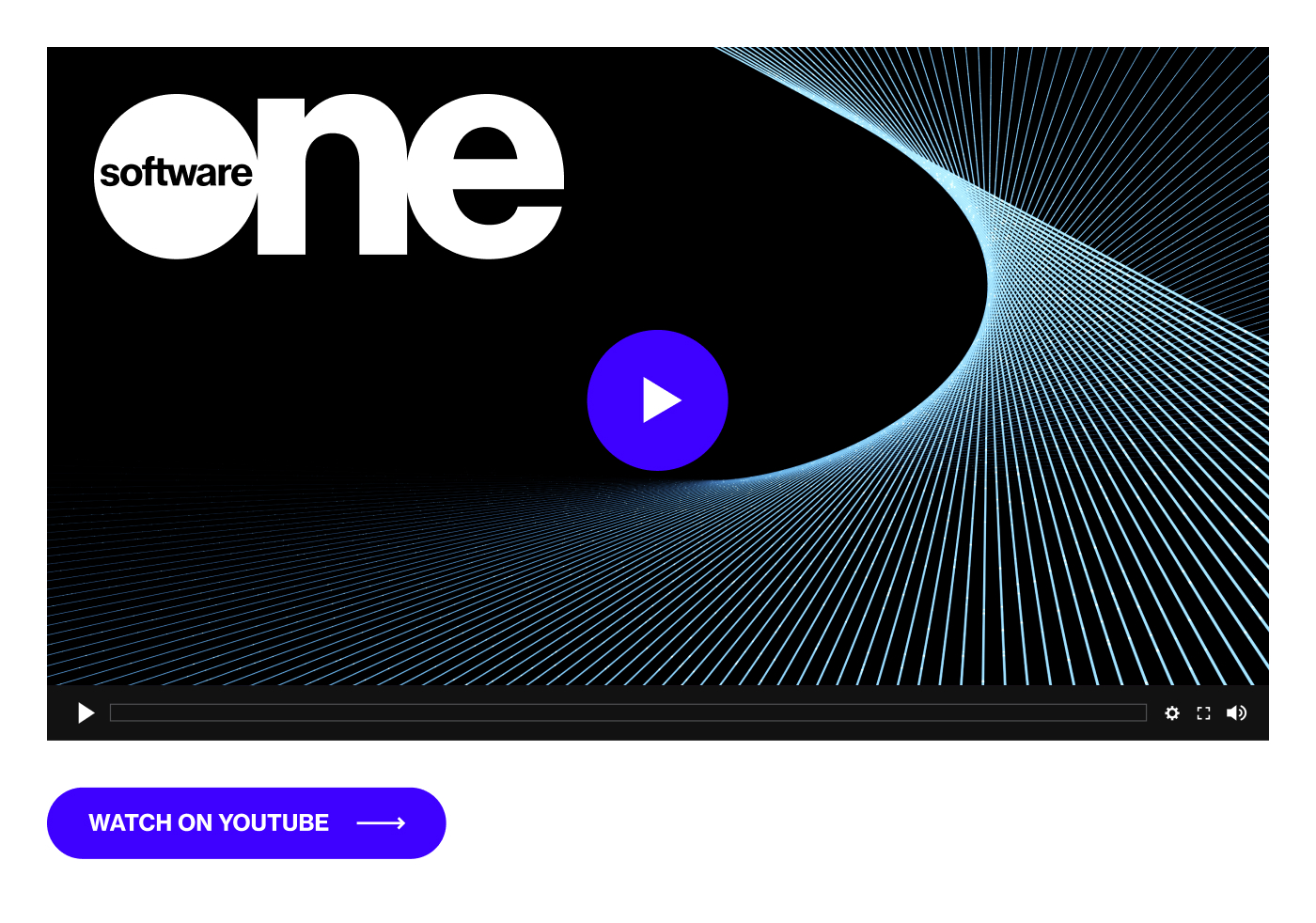
%20-%20Text%20Only.jpg)
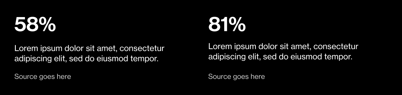
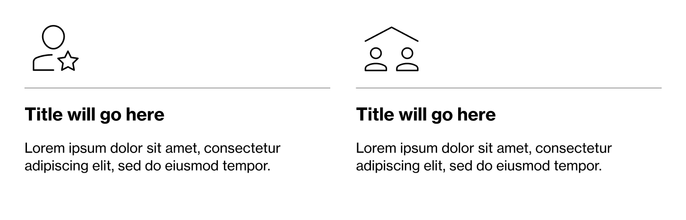

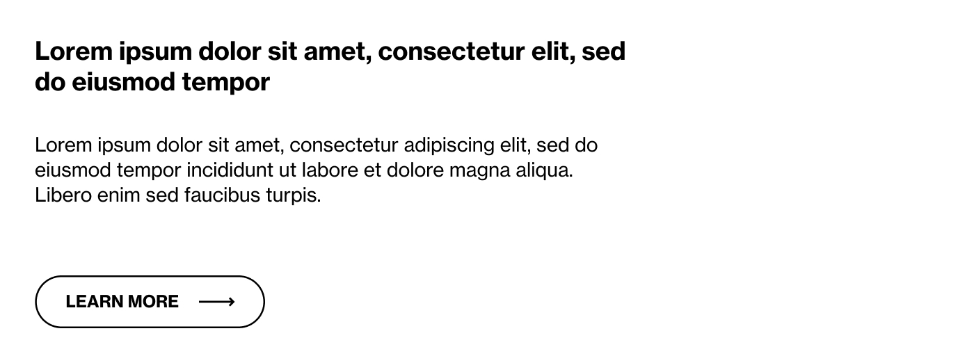
%20-%20Text%20on%20right%2C%20Video%20on%20left.jpg)
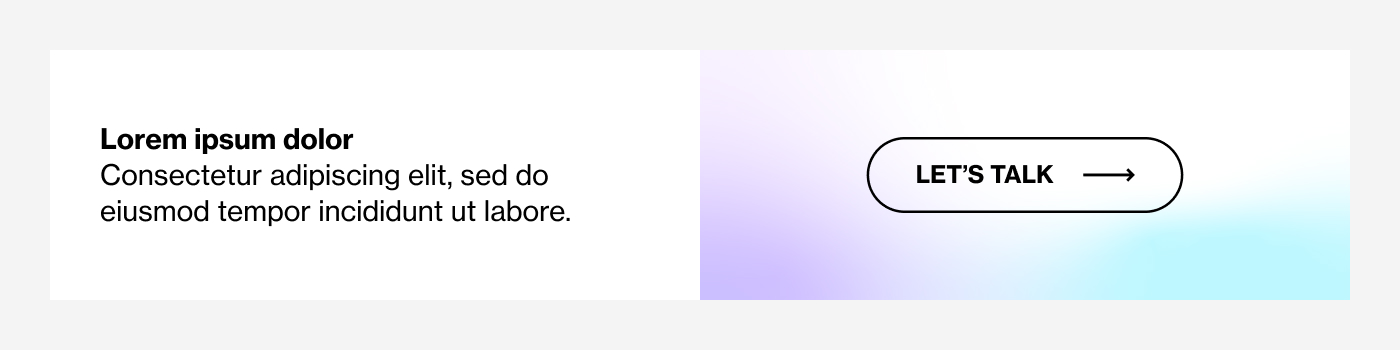
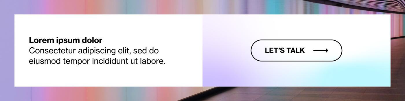
%20-%20Text%20and%20CTA%20with%20Branded%20Phrase.jpg)
%20-%20Text%20and%20CTA%20with%20Image.jpg)
%20-%20Text%20and%20CTA%20on%20Image.jpg)
%20-%20Text%20and%20CTA%20with%20Image2.jpg)
%20-%20Text%20and%20CTA%20with%20Image.jpg)

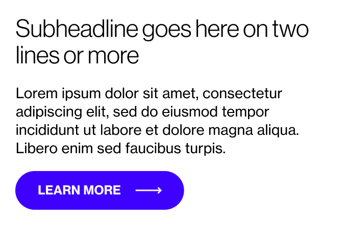
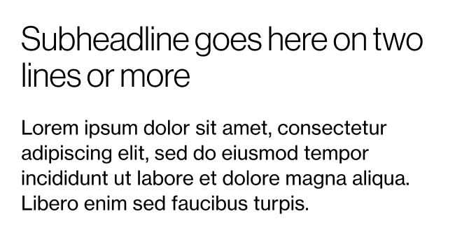
%20-%20Text%20on%20right%2C%20Video%20on%20left.jpg)
%20-%20Text%20Only.jpg)
%20-%20Text%20on%20left%2C%20Video%20on%20right%20with%20CTA.jpg)